Drool on the Frog

Monday, September 22, 2008

MoPo: Jan von Hollenben, photographer


I love the photography by Jan von Holleben. He uses perspective to compose the most unique photos.

In The Great Masters he uses nothing but hands and arms to recreate works from art masters like Picasso and Mondrian.

Using depth, perspective, and some retro furnishings see what kind of superheroes he invents.

But my favorite is the group called Dreams of Flying. These look like so much fun. Using everyday objects, he creates the most amazing special effects. It's fun to come up with your own Dreams of Flying. Be sure and see the creativity von Holleben has inspired.

Labels: ,

Monday, September 15, 2008

MoPo: Coffee & Foam Art


Some might say that artists can be characterized by their addictions (caffeine, nicotine, or, um, others). But I never thought about making my addiction the art - two of my favorite things in the world. See what these creative individuals can do with the foam on the top of their cup of joe.

Enjoy!

I'm sorry, I don't remember where I found this original link. I like to give credit and also hook you up with other good resources, but all I recorded was this link.

Labels: ,

Wednesday, September 10, 2008

Project: Oil Tank 3.0

Project: Oil Tank 1.0
Project: Oil Tank 2.0
Project: Oil Tank 4.0

I was able to paint some yesterday but the rains started in the afternoon and they're predicted to continue through the week.

Color science is very complicated and I won't even pretend to know much about it. If I did know more, I might be more comfortable using color. I do know that the color you see on your computer screen or in a projected image is entirely different than color you get in paint or color pencils. I bring this up because my design was created on the computer. A computer monitor creates color using light. Color on paper is created by mixing ink pigment. That's why your printouts don't look like what you see on the computer monitor. These are two different color sciences.

Color palette for the front of the tank.

Color palette for the side of the tank.

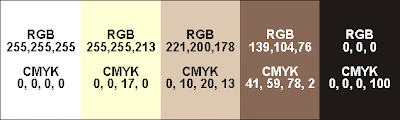
Here are the "color swatches" for my design. Even these don't look totally accurate. That taupe color in the Front swatch (RGB 139, 104, 76) is really a red mauve and the black in the Side swatch (RGB 0,0,0) is kind of dark brown. Color is tricky.

The night I traced the areas for the red mauve color, I started out using a red based prisma color but, at night, I couldn't see my pencil marks so I couldn't tell where I was at. I quickly had to switch to a blue prisma pencil that I could see in the projection. When I started painting the yellow, the brush sometimes picked up the blue prisma color and blended into the yellow making green. This is something I thought might happen but, there's so little blue getting mixed in, I don't think it'll be a problem with a couple more coats of yellow.

I was also worried about the prisma colors creating a resist to the acrylic, sort of like trying to paint on waxed paper. There's been little trouble with this except for the yellow prisma color. It's interesting that the yellow pigment created more of a resist than white, blue or red.

The paint is going on kind of thin. Since the background is black, the paint is somewhat transparent, so, I'll need to put on two or more coats to get the colors opaque. My original plan was to completely finish all the white and then move on to the next lightest shade and completely finish it. This became kind of boring so then I switched to covering up all my trace lines with the appropriate color.

This turns out to serve second purpose. Getting my design traced using the paint will help preserve the design. I have it covered in plastic and I don't think the prisma colors will wash off easily but with seven days of rain I didn't want to take any chances. Even if the tank just ended up with splatters of dirt and mud, it would be impossible to get off without ruining the prisma color lines.

Tracing in all the colors also showed me how complicated my design is. Looking at a yellow line I'd know that either to the right or the left of that line is suppose to be painted yellow but the other side is suppose to be painted mauve. But which side? I'd have to trace the yellow line back or check the print out of my design to figure out which.

During the rainy days to come I'll probably read my backlog of library books (all due 9/22), write to my blog, and put together the curriculum for my PowerPoint and Word classes. I also need a new art project after this one!

The next step is to order the laquer sealer, mix the colors for the frog and then paint, paint, paint.

(As I write this I'm enjoying a cup of Iced Hazelnut coffee from McDonalds.)

Project: Oil Tank 1.0
Project: Oil Tank 2.0
Project: Oil Tank 4.0

At the end of week 3

MORE ON MIXING PAINT
I took the RGB values (the way color is formulated with light) from my computer design and tried to get a CMYK color (the way color is formulated with pigment) to match it as closely as possible (To do this I used this tool by Peter Forret). I thought the CMYK would help me with mixing the paint. For instance, the yellow color (CMYK 0, 0, 17, 0) has 0 Cyan (blue), 0 Magenta (red), 17 Yellow, and 0 blacK. Since the color is a tint of yellow I figured it was 17 parts yellow and 83 parts white. This theory worked o.k. with the first two color mixes but was way off when I mixed the red mauve (CMYK 49, 51, 78, 2). I did not need 49 parts blue! I ended up adding tons of red and some more yellow to get the shade right. Oh, well, it was an interesting experiment. I was just glad I got the colors mixed fairly easily in the end.

Some other helpful web sites regarding color charts and colors for web sites, try these:
HYPE'S Color Specifier
VisiBone's free color services (scroll to the bottom of their home page)

My model.

Labels: , ,

Monday, September 08, 2008

MoPo: Woodrow Wilson High Seniors


I love seeing art encouraged in kids - especially in the 9th-12th grade years. Studio arts are rare at the grade level. Probably budget cuts.

Anyway, check out the wonderfully creative art project at Woodrow Wilson High in Dallas. (MyGeek found the link from FrontBurner, a great Dallas area blog.) As a fundraiser, Seniors could pay to paint their parking spots. Lots of creative work. Although some of them look like they've maybe had graffiti experience before. Hmm.

At least the young are being raised on good quality rock music.

Labels: ,

Wednesday, September 03, 2008

Project: Oil Tank 2.0

Project: Oil Tank 1.0
Project: Oil Tank 3.0
Project: Oil Tank 4.0

Most of my crazy projects are done for two reasons: to do something fun and to learn by doing something totally new and experimental. There's been a lot to learn from my oil tank project.

This past week I got the entire design traced onto the tank and started painting.

First, I altered the colors in the design. When I tested the projection of the design against the tank, it was hard to distinguish the white areas from the pale yellow so I change white to blue.

It only took two nights to trace the design: one night to trace the end design and one night to trace the front design. Our friend, TJ, owns an A/V company and he generously gave me a long term loan of one of his projectors: a Panasonic PT-LC76U LCD. I had to do all the tracing after sunset and I only had one shot to get the design done. There was no way to do part of the dog's face and then come back and finish it on another night - it would be impossible to realign the projector exactly where it was the night before. The largest part of the design took me a little over two hours to trace. The very exciting 21 second video below is me tracing the end design and swatting away bugs attracted to the light.


I wasn't quite sure what type of pen or pencil was going to write effectively on the tank. It could be permanent as long as the acrylic paints would completely cover it. It couldn't be too sensitive because it would probably take me a couple of weeks to paint the whole design so it needed to hold up to the afternoon sun. I have the tank covered in plastic so hopefully it won't get wet. By accident, I discovered the most effective drawing tool was Prisma color pencils. (See below for more details on the pens I tested.)

Now that the design was on the tank, I could work in the day time when there were fewer bugs!

To save money I bought only white, red, yellow and blue acrylic paint (I already had black). Even though my design only has seven colors, at around $9 a tube, it was going to cost a lot so I'm going to see how difficult it's going to be to mix my own colors. Buying the four colors in a set was like getting one tube free.

I start by painting the lightest color first. The first day I painted I got most of the white finished.

Next I will need to mix the remaining paint colors and store in air tight containers.

Stay tuned for updates on this project.

(As I write this I'm enjoying a warm Duncan Hines Peanut Butter Cup Candy Shop Brownies and a side of Breyers All Natural Homemade Vanilla ice cream and a bottle of Le Bleu water.)

Project: Oil Tank 1.0
Project: Oil Tank 3.0
Project: Oil Tank 4.0

DESIGN IN CORELDRAW

I created the original design for Art Unleashed 2006. Here is what I remember, step-by-step, of that process from two years ago using the CorelDraw Graphics Suite software.
  1. Snap several pictures of your dog until I find the one you want to work with.

  2. Upload the pictures to your computer.

  3. Open a new document in CorelDraw.

  4. Select Import under the File menu and import the picture.

  5. Double click on the picture to open it in Corel PhotoPaint.

  6. First, I cut out the image of Willa (cutting out all the background) using the Cutout Lab under the Image menu. Cutout Lab works best if you are zoomed in tight on your image, especially if you're dealing with hair or any fine textures. I made my nib size at least 15 and then traced around Willa's head. (Click image to enlarge.)

  7. When finished tracing, click Ok. The Cutout Lab window will close and the traced image, minus the background, will appear.
  8. Fix any red eye, if you have any.

  9. Save the cutout and close Corel PhotoPaint. The cutout should now appear back in CorelDraw.

  10. Next I did a PowerTRACE. Right click on the image and select Trace Bitmap/Low Quality Image. There are several options to choose from here. You need to decide how much detail you want in the traced image and how many colors you want to use (I used 5). You just have to play with this.

  11. Don't forget to save your work.

PROJECTION ISSUES
  • The design is very complicated so I need to project it onto the side of the tank and trace it. My friend Erin asked me if I was going to use a tracer projector. I didn't even know these existed but, sure enough, you can buy a simplified projection system for enlarging and projecting. She said she got hers for about $30. I found some on DickBlick but you could also use the weekly A.C. Moore 40% off coupon to get one.

  • The initial color of the tank was gray. The background color of my design is black. What I had to test first was whether my design would project onto a black surface. When it comes to color and light, I know a lot less than color in print. While the tank was still gray, I projected my design outside onto a piece of black cardboard. The design showed up clear as a bell. This was great news because it meant that I could paint the black background before starting the design not after it was finished which would be much more tedious.

  • It would be even more impossible to trace part of the design then set up the projector the next night and line it up to what had already been done. Projection is way too sensitive for that (zoom, focus, tilt, horizontal level, etc.), not to mention positioning the image source in the exact same spot as well. Even while I was tracing the design, I noticed it would creep a little. How and why is still a mystery to me.

PENCIL TEST

I tested several writing implements to see which would:
  1. semi-permanent to permanent
  2. not be affected by heat
  3. not be easily rubbed off
  4. covered over easily with acrylic paint

Here's how the test went:
  • Sharpie Metallic, silver- Works great but the tip is too broad and there aren't enough colors.
  • Sharpie Poster Paint, white - Worked great but the only store where I knew they were sold has gone out of business.
  • DecoColor Opaque Paint Marker (extra fine tip), silver - Difficult to work with; expensive for this kind of use.
  • Conte Pastel pencil, white - Too delicate; easy to rub off.
  • Stabilo All, orange, yellow, green, red - More brittle than I expected. Worked better than anything else but I only had three colors.
The Winner - Prisma color pencils
Not too soft, lots of colors, and I can sharpen them to as fine a point as I want.


PAINT


This set comes with a color wheel poster with instructions on how to mix paints.

Labels: , ,

Monday, September 01, 2008

MoPo: Sam Winston

I love type! I've always been a font junky. Seeing letters as an art medium is just another way of proving I'm a geek.

Check out the 2-D type sculptures/collage of Sam Winston. For me, they are absolutely thrilling and exciting.

As my friend, the pharma rep says, "It makes me happy."

Labels: ,