Project: Oil Tank 3.0
Project: Oil Tank 1.0
Project: Oil Tank 2.0
Project: Oil Tank 4.0
 I was able to paint some yesterday but the rains started in the afternoon and they're predicted to continue through the week.
Color science is very complicated and I won't even pretend to know much about it. If I did know more, I might be more comfortable using color. I do know that the color you see on your computer screen or in a projected image is entirely different than color you get in paint or color pencils. I bring this up because my design was created on the computer. A computer monitor creates color using light. Color on paper is created by mixing ink pigment. That's why your printouts don't look like what you see on the computer monitor. These are two different color sciences.
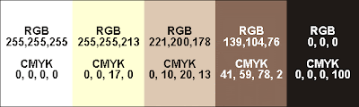 Color palette for the front of the tank.
 Color palette for the side of the tank.
Here are the "color swatches" for my design. Even these don't look totally accurate. That taupe color in the Front swatch (RGB 139, 104, 76) is really a red mauve and the black in the Side swatch (RGB 0,0,0) is kind of dark brown. Color is tricky.
 The night I traced the areas for the red mauve color, I started out using a red based prisma color but, at night, I couldn't see my pencil marks so I couldn't tell where I was at. I quickly had to switch to a blue prisma pencil that I could see in the projection. When I started painting the yellow, the brush sometimes picked up the blue prisma color and blended into the yellow making green. This is something I thought might happen but, there's so little blue getting mixed in, I don't think it'll be a problem with a couple more coats of yellow.
I was also worried about the prisma colors creating a resist to the acrylic, sort of like trying to paint on waxed paper. There's been little trouble with this except for the yellow prisma color. It's interesting that the yellow pigment created more of a resist than white, blue or red.
 The paint is going on kind of thin. Since the background is black, the paint is somewhat transparent, so, I'll need to put on two or more coats to get the colors opaque. My original plan was to completely finish all the white and then move on to the next lightest shade and completely finish it. This became kind of boring so then I switched to covering up all my trace lines with the appropriate color.
This turns out to serve second purpose. Getting my design traced using the paint will help preserve the design. I have it covered in plastic and I don't think the prisma colors will wash off easily but with seven days of rain I didn't want to take any chances. Even if the tank just ended up with splatters of dirt and mud, it would be impossible to get off without ruining the prisma color lines.
Tracing in all the colors also showed me how complicated my design is. Looking at a yellow line I'd know that either to the right or the left of that line is suppose to be painted yellow but the other side is suppose to be painted mauve. But which side? I'd have to trace the yellow line back or check the print out of my design to figure out which.
 During the rainy days to come I'll probably read my backlog of library books (all due 9/22), write to my blog, and put together the curriculum for my PowerPoint and Word classes. I also need a new art project after this one!
The next step is to order the laquer sealer, mix the colors for the frog and then paint, paint, paint.
(As I write this I'm enjoying a cup of Iced Hazelnut coffee from McDonalds.)
Project: Oil Tank 1.0
Project: Oil Tank 2.0
Project: Oil Tank 4.0
 At the end of week 3
MORE ON MIXING PAINT
I took the RGB values (the way color is formulated with light) from my computer design and tried to get a CMYK color (the way color is formulated with pigment) to match it as closely as possible (To do this I used this tool by Peter Forret). I thought the CMYK would help me with mixing the paint. For instance, the yellow color (CMYK 0, 0, 17, 0) has 0 Cyan (blue), 0 Magenta (red), 17 Yellow, and 0 blacK. Since the color is a tint of yellow I figured it was 17 parts yellow and 83 parts white. This theory worked o.k. with the first two color mixes but was way off when I mixed the red mauve (CMYK 49, 51, 78, 2). I did not need 49 parts blue! I ended up adding tons of red and some more yellow to get the shade right. Oh, well, it was an interesting experiment. I was just glad I got the colors mixed fairly easily in the end.
Some other helpful web sites regarding color charts and colors for web sites, try these:
HYPE'S Color Specifier
VisiBone's free color services (scroll to the bottom of their home page)
 My model.
Project: Oil Tank 2.0
Project: Oil Tank 4.0
 I was able to paint some yesterday but the rains started in the afternoon and they're predicted to continue through the week.
Color science is very complicated and I won't even pretend to know much about it. If I did know more, I might be more comfortable using color. I do know that the color you see on your computer screen or in a projected image is entirely different than color you get in paint or color pencils. I bring this up because my design was created on the computer. A computer monitor creates color using light. Color on paper is created by mixing ink pigment. That's why your printouts don't look like what you see on the computer monitor. These are two different color sciences.
 Color palette for the front of the tank.
 Color palette for the side of the tank.
 The night I traced the areas for the red mauve color, I started out using a red based prisma color but, at night, I couldn't see my pencil marks so I couldn't tell where I was at. I quickly had to switch to a blue prisma pencil that I could see in the projection. When I started painting the yellow, the brush sometimes picked up the blue prisma color and blended into the yellow making green. This is something I thought might happen but, there's so little blue getting mixed in, I don't think it'll be a problem with a couple more coats of yellow.
I was also worried about the prisma colors creating a resist to the acrylic, sort of like trying to paint on waxed paper. There's been little trouble with this except for the yellow prisma color. It's interesting that the yellow pigment created more of a resist than white, blue or red.
 The paint is going on kind of thin. Since the background is black, the paint is somewhat transparent, so, I'll need to put on two or more coats to get the colors opaque. My original plan was to completely finish all the white and then move on to the next lightest shade and completely finish it. This became kind of boring so then I switched to covering up all my trace lines with the appropriate color.
This turns out to serve second purpose. Getting my design traced using the paint will help preserve the design. I have it covered in plastic and I don't think the prisma colors will wash off easily but with seven days of rain I didn't want to take any chances. Even if the tank just ended up with splatters of dirt and mud, it would be impossible to get off without ruining the prisma color lines.
Tracing in all the colors also showed me how complicated my design is. Looking at a yellow line I'd know that either to the right or the left of that line is suppose to be painted yellow but the other side is suppose to be painted mauve. But which side? I'd have to trace the yellow line back or check the print out of my design to figure out which.
 During the rainy days to come I'll probably read my backlog of library books (all due 9/22), write to my blog, and put together the curriculum for my PowerPoint and Word classes. I also need a new art project after this one!
The next step is to order the laquer sealer, mix the colors for the frog and then paint, paint, paint.
(As I write this I'm enjoying a cup of Iced Hazelnut coffee from McDonalds.)
Project: Oil Tank 1.0
Project: Oil Tank 2.0
Project: Oil Tank 4.0
 At the end of week 3
MORE ON MIXING PAINT
I took the RGB values (the way color is formulated with light) from my computer design and tried to get a CMYK color (the way color is formulated with pigment) to match it as closely as possible (To do this I used this tool by Peter Forret). I thought the CMYK would help me with mixing the paint. For instance, the yellow color (CMYK 0, 0, 17, 0) has 0 Cyan (blue), 0 Magenta (red), 17 Yellow, and 0 blacK. Since the color is a tint of yellow I figured it was 17 parts yellow and 83 parts white. This theory worked o.k. with the first two color mixes but was way off when I mixed the red mauve (CMYK 49, 51, 78, 2). I did not need 49 parts blue! I ended up adding tons of red and some more yellow to get the shade right. Oh, well, it was an interesting experiment. I was just glad I got the colors mixed fairly easily in the end.
Some other helpful web sites regarding color charts and colors for web sites, try these:
HYPE'S Color Specifier
VisiBone's free color services (scroll to the bottom of their home page)
 My model.
posted by rhon at
6:08 PM
|
1 comments




 Last month My Geek and I worked on his new web site. I didn't do much, actually. He coded the whole thing but I finished the frog logo for the site and exported it to a web site gif. I also suggested some color schemes based on his preferences. I think it's a great looking site. It'll grow as his business grows but I think it has a great core design.

 I agree with Napolean Dynamite's brother, Kip, "I love technology." The majority of my work, play and volunteer work is done using a computer.


